So the astute amongst you may have noticed that there has been a slight change with my website.
Those of you new to the site....well where have you been?
Photographer's websites are a funny thing. They are basically your shop window. But being photographers we're not usually that good with words, like. So it's all about the images.
It's been a couple of years since I last updated my website.
The history of my website goes a bit like this:
2008 - use an off the shelf photography website template from a company advertised in the back of a photography magazine
2010 - rebuild website using Wordpress as the back end, keeping the same design
2012 - rebuild website with Wordpress but updating a few things like the homepage and some functionality
2014 - build new site from scratch as technology and the way we use website has changed so much
It's been a really interesting process starting again. (If i'm honest it's been on my list of things to do for a good six months.) Throughout all of the website, i've kept the same clean white background and menu on the left hand side, so it is an evolution, but this site feels like a revolution.
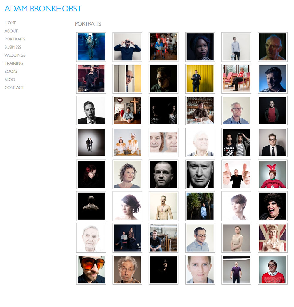
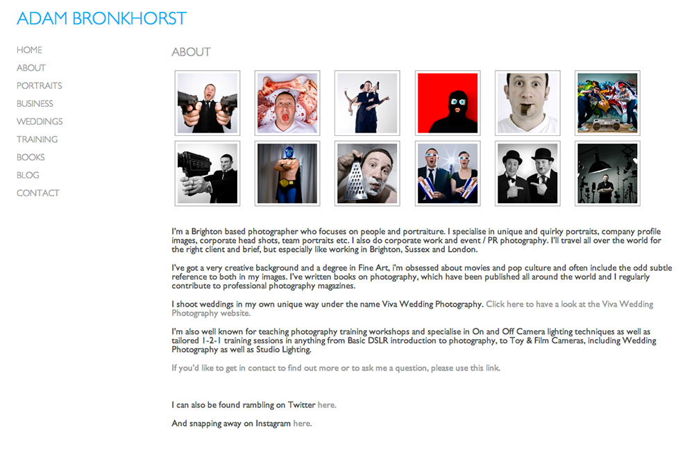
Looking at my stats it seems that around 40% of people are looking at the site on mobile devices. And while the old site worked well on the web, it didn't for mobile. So that needed to change. I also wanted people to get a good overview of all the images. The old site had small thumbnails and cropped them to squares. I wanted the new site to display images in the way that Pinterest does, as lets face it, people are lazy and have shot attention spans. So the chances of them clicking though all the images were small. So this way with a quick scroll, you can see all the images. The site also had to be responsive to the screen they were viewing it on, I use a 27" iMac and the old site looked tiny on that. The images were also small and it didn't do them justice. While I know that not everyone will be using a massive screen, I did want the images to fill what ever size screen they were using. Now it does.
So I do hope you like the new site....i'm really pleased with it and just to show you how much it's been updated here are a couple of screen grabs of the old site:

